Deskription av kategoriska data i R
Categorical Data Descriptive Statistics
Descriptive statistics are the first pieces of information used to understand and represent a dataset. There goal, in essence, is to describe the main features of numerical and categorical information with simple summaries. These summaries can be presented with a single numeric measure, using summary tables, or via graphical representation. Here, I illustrate the most common forms of descriptive statistics for categorical data but keep in mind there are numerous ways to describe and illustrate key features of data.
tl;dr
This tutorial covers the key features we are initially interested in understanding for categorical data, to include:
- Frequencies: The number of observations for a particular category
- Proportions: The percent that each category accounts for out of the whole
- Marginals: The totals in a cross tabulation by row or column
- Visualization: We should understand these features of the data through statistics and visualization
Replication Requirements
To illustrate ways to compute these summary statistics and to visualize categorical data, I’ll demonstrate using this data which contains artificial supermarket transaction data. In addition, the packages we will leverage include the following:
library(readxl)         # for reading in excel data
library(ggplot2)        # for generating visualizations
☛ See Working with packages for more information on installing, loading, and getting help with packages.
First, let’s read in the data. The data frame consists of 16 variables, which I illustrate a select few below:
supermarket <- read_excel("Data/Supermarket Transactions.xlsx", sheet = 2)

head(supermarket[, c(3:5,8:9,14:16)])
##   Customer ID Gender Marital Status Annual Income          City     Product Category Units Sold Revenue
## 1        7223      F              S   $30K - $50K   Los Angeles          Snack Foods          5   27.38
## 2        7841      M              M   $70K - $90K   Los Angeles           Vegetables          5   14.90
## 3        8374      F              M   $50K - $70K     Bremerton          Snack Foods          3    5.52
## 4        9619      M              M   $30K - $50K      Portland                Candy          4    4.44
## 5        1900      F              S $130K - $150K Beverly Hills Carbonated Beverages          4   14.00
## 6        6696      F              M   $10K - $30K Beverly Hills          Side Dishes          3    4.37
Frequencies
To produce contingency tables which calculate counts for each combination of categorical variables we can use R’s table() function. For instance, we may want to get the total count of female and male customers.
# counts for gender categories
table(supermarket$Gender)
##
##    F    M
## 7170 6889
If we want to understand the number of married and single females and male customers we can produce a cross classification table:
# cross classication counts for gender by marital status
table(supermarket$`Marital Status`, supermarket$Gender)
##
##        F    M
##   M 3602 3264
##   S 3568 3625
We can also produce multidimensional tables based on three or more categorical variables. For this, we leverage the ftable() function to print the results more attractively. In this case we assess the count of customers by marital status, gender, and location:
# customer counts across location by gender and marital status
table1 <- table(supermarket$`Marital Status`, supermarket$Gender,
                supermarket$`State or Province`)

ftable(table1)
##        BC   CA   DF Guerrero Jalisco   OR Veracruz   WA Yucatan Zacatecas
##
## M F   190  638  188       77      15  510      142 1166     200       476
##   M   197  692  210       94       5  514      108 1160     129       155
## S F   183  686  175      107      30  607      125 1134     164       357
##   M   239  717  242      105      25  631       89 1107     161       309
Proportions
We can also produce contingency tables that present the proportions (percentages) of each category or combination of categories. To do this we simply feed the frequency tables produced by table() to the prop.table()function. The following reproduces the previous tables but calculates the proportions rather than counts:
# percentages of gender categories
table2 <- table(supermarket$Gender)
prop.table(table2)
##
##         F         M
## 0.5099936 0.4900064

# percentages for gender by marital status
table3 <- table(supermarket$`Marital Status`, supermarket$Gender)
prop.table(table3)
##
##             F         M
##   M 0.2562060 0.2321644
##   S 0.2537876 0.2578420

# customer percentages across location by gender and marital status
# using table1 from previous code chunk
ftable(round(prop.table(table1), 3))
##         BC    CA    DF Guerrero Jalisco    OR Veracruz    WA Yucatan Zacatecas
##
## M F  0.014 0.045 0.013    0.005   0.001 0.036    0.010 0.083   0.014     0.034
##   M  0.014 0.049 0.015    0.007   0.000 0.037    0.008 0.083   0.009     0.011
## S F  0.013 0.049 0.012    0.008   0.002 0.043    0.009 0.081   0.012     0.025
##   M  0.017 0.051 0.017    0.007   0.002 0.045    0.006 0.079   0.011     0.022
Marginals
Marginals show the total counts or percentages across columns or rows in a contingency table. For instance, if we go back to table3 which is the cross classication counts for gender by marital status:
table3
##
##        F    M
##   M 3602 3264
##   S 3568 3625
We can compute the marginal frequencies with margin.table() and the percentages for these marginal frequencies with prop.table() using the margin argument:
# FREQUENCY MARGINALS
# row marginals - totals for each marital status across gender
margin.table(table3, 1)
##
##    M    S
## 6866 7193

# colum marginals - totals for each gender across marital status
margin.table(table3, 2)
##
##    F    M
## 7170 6889


# PERCENTAGE MARGINALS
# row marginals - row percentages across gender
prop.table(table3, margin = 1)
##
##             F         M
##   M 0.5246140 0.4753860
##   S 0.4960378 0.5039622

# colum marginals - column percentages across marital status
prop.table(table3, margin = 2)
##
##             F         M
##   M 0.5023710 0.4737988
##   S 0.4976290 0.5262012
Visualization
Bar charts are most often used to visualize categorical variables. Here we can assess the count of customers by location:
ggplot(supermarket, aes(x = `State or Province`)) +
        geom_bar() +
        theme(axis.text.x = element_text(angle = 45, hjust = 1))

To make the bar chart easier to digest we can reorder the bars in descending order. Note that there are multiple ways to reorder bar charts, just search “Order Bars in ggplot2 bar graph” in Stackoverflow. Here I create a function that sorts the underlying factors and then apply that function in ggplot.
# re-order levels
reorder_size <- function(x) {
        factor(x, levels = names(sort(table(x), decreasing = TRUE)))
}

ggplot(supermarket, aes(x = reorder_size(`State or Province`))) +
        geom_bar() +
        xlab("State or Province") +
        theme(axis.text.x = element_text(angle = 45, hjust = 1))

We can also produce a proportions bar chart where the y-axis now provides the percentage of the total that that category makes up.
# Proportions bar charts
ggplot(supermarket, aes(x = reorder_size(`State or Province`))) +
        geom_bar(aes(y = (..count..)/sum(..count..))) +
        xlab("State or Province") +
        scale_y_continuous(labels = scales::percent, name = "Proportion") +
        theme(axis.text.x = element_text(angle = 45, hjust = 1))

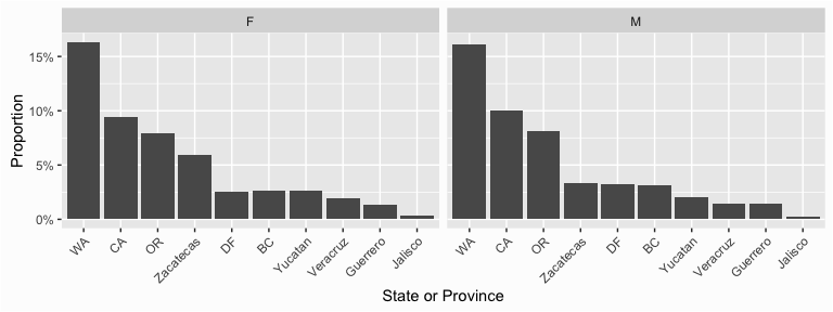
We can also create contingency table-like bar charts by using the facet_grid()function to produce small multiples. Here I plot customer proportions across location and by Gender.
ggplot(supermarket, aes(x = reorder_size(`State or Province`))) +
        geom_bar(aes(y = (..count..)/sum(..count..))) +
        xlab("State or Province") +
        scale_y_continuous(labels = scales::percent, name = "Proportion") +
        facet_grid(~ Gender) +
        theme(axis.text.x = element_text(angle = 45, hjust = 1))
I can also do the same plot by Gender and by Marital status.
ggplot(supermarket, aes(x = reorder_size(`State or Province`))) +
        geom_bar(aes(y = (..count..)/sum(..count..))) +
        xlab("State or Province") +
        scale_y_continuous(labels = scales::percent, name = "Proportion") +
        facet_grid(`Marital Status` ~ Gender) +
        theme(axis.text.x = element_text(angle = 45, hjust = 1))
